Thursday, 7 April 2011


Wednesday, 6 April 2011
AS Brief
- Construct the front page, contents and double page spread of a new music magazine.
Ancillary task- Create the front cover for a school magazine.
A2 Brief- In a group, construct a film trailer.
Ancillary tasks- Make a film magazine front cover featuring the film.
- Construct a poster for the film
- Construct the front page, contents and double page spread of a new music magazine.
Ancillary task- Create the front cover for a school magazine.
A2 Brief- In a group, construct a film trailer.
Ancillary tasks- Make a film magazine front cover featuring the film.
- Construct a poster for the film
| AS Digital Technology |
Used photo shop to edit our images e.g. remove background Use adobe indesign to construct music magazine Used internet to research usual codes and conventions of real magazines to incorporate into our own Used Microsoft word to write up evaluation of our music magazine Used video camera to film our evaluation |
| A2 Digital Technology |
Used digital camera to take shots for animatic Used video camera to film shots for film trailer and to film discussion on storylines Used internet to research codes and conventions of real film trailers and incorporated them into our trailer Used Adobe premiere elements 4.0 to edit our trailer together Used adobe indesign to construct film poster and magazine Used photo shop to edit our images e.g. remove background |
| AS Creativity |
Had to create designs for front cover, contents and double page spread of music magazine Had to take photos for both magazines and decide which angles to take them from were best Had to construct magazine front covers, contents and double page spread in adobe indesign |
| A2 Creativity |
Had to put shots for film trailer in order we wanted them in Had to cast roles in trailer for the respective characters Had to come up with props for trailer and animatic Had to plan locations, settings, costume etc for animatic and trailer Had to construct animatic and trailer in adobe premiere elements 4.0 Had to create designs for poster and film magazine Had construct poster and film magazine in adobe indesign Had to improvise with some shots for trailer due to numerous circumstances |
| AS Research and planning |
Had to research usual conventions of music magazines contents pages Had to research usual conventions of music magazines double page spread articles Used questionnaires for school magazine to find out what the target audience wanted Used questionnaires for music magazine to find out what type of music magazines are popular, which mastheads appeal to them the most etc |
| A2 Research and planning |
Had to research usual conventions of psychological films, film trailers to incorporate them into our own Had to plan when we would take the shots for animatic and trailer Had to plan what props we would use Had to plan the settings, locations, lighting etc for animatic and trailer Had to research usual conventions of film magazines e.g. Layout Had to research usual conventions of film posters e.g. Layout |
| AS Post-production |
Had to change colour schemes to match from front cover through to contents and double page spread Had to take subsidiary photos for magazines and edit them Had to retake any photos that weren’t good enough |
| A2 Post-production |
Had to re-shoot some shots which weren’t good enough or didn’t fit in with trailer Had to add titles and billing block to trailer Had to edit shots in order and timings that were planned Had to make sure that there was continuity in the trailer Had to add some sound effects to animatic and trailer Had to alter images for poster and magazine to fit into layout Had to take subsidiary photos for magazine and edit them Had to retake photos that weren’t good enough |
| AS conventions of real media texts |
Used layouts from real music magazines to create front cover, contents and double page article Used editing software to edit images Used digital camera to capture images Used design software to construct magazine |
| A2 conventions of real media texts |
Used the layout of real film magazines to create our film magazine Used the layout of film posters to create our own Used shooting schedule to plan our shoots and timings Used a video camera to film trailer shots Used video software to edit shots of film trailer and to put them in order Used digital camera for capturing images for film magazine and poster Used design software to construct magazine and poster Used music that complimented the timing and genre of trailer |
Tuesday, 15 February 2011
Film poster analysis
Film Poster Analysis
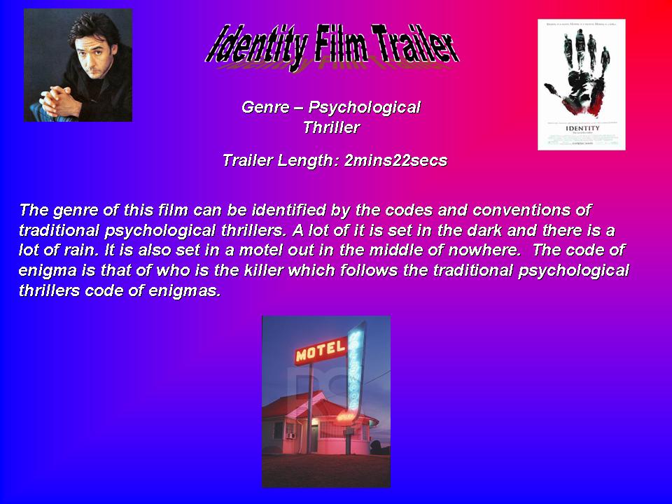
The title suggests that the number 7 is an important number within the film and that it has something to do with the two main characters depicted on the front. The main image is of two men who seem to be very focused. I think it is multi-layered as the images of the characters are overlapping. The questions raised from the main image is who are these two men and what connection do they have to each other and to the number 7. The main actors are both illuminated by light and partly obscured by shadow. Both of their faces are half light and half dark which suggest good and bad or maybe there are two sides of these characters. Brad Pitt looks very tense and focused with his eyes looking straight at you. Morgan Freeman looks very calm, calculated and has no emotion on his face. They seem to be opposites of each other which also link to light and dark. The Iconography on this poster is the title which is red which usually symbolises blood. This feature is quite prominent in psychological thrillers. I think the poster suggests that this film is more than one genre as it says “A nerve-jangling thriller with a gut wrenching climax!” This claim is put forward from a film magazine which suggests that this film is thought highly of. It also suggests the film is a psychological thriller/horror. I think this film offers visceral pleasures as it is clear people are going to be killed. I think the target audience is predominantly male (60% male-40%female) but and is aimed at people aged 25- 40. I believe this because the two main characters are male but Brad Pitt attracts female attention and because Morgan Freeman who is older appeals to the older generation. The film stars are Brad Pitt and Morgan Freeman who are both household names and are showcased by the poster. Their names are at the top of the poster because it will be the first thing you see and they only showcase good well known actors. I believe when you see big names in the film industry it makes you want to see the film more as you know that they are very good at what they do. The movies tagline “Seven deadly sins. Seven ways to die.” This suggests that this film may have something to do with religion as it says sins which usually mean you have done something against a religion/god. The seven ways to die suggests that each sin has a way of death that occurs when that sin is committed. I think this film has two very well known actors in Brad and Morgan Freeman who aren’t usually associated with psychological thriller films which I think is a unique selling point of this film. Something that sets it apart from other films is that there are only two main characters as in other films of the same genre there is usually a group of people. This is because when you have a group, they are all usually linked to each other and the intellectual puzzle is how these people are linked but with only two main characters this is much harder to do.

Critique
Illogic Animatic
Our Animatic is a collection of still images captured by a camera which were put in order from our storyboard to give us an idea of timing and if the shots we were using actually fitted together before we make our trailer. For the completion of our Animatic we went out ten times to shoot the images we needed were at eight different locations. The props we used consisted of an old rusty key, a clock, rope, a ribbon, a phone, a car and a load of photos. Our main actor was within our group, and we chose her because we knew she would be reliable which may have not of been the case if we had chosen someone else outside the group. There was one shot that we were unable to do which was of a point of view shot from the main character looking at two monitors with one of them showing her mother and the other showing her boyfriend. We were unable to do this shot as weren’t sure how were going to get this footage onto the two monitors. We made one change which was to put a flashback image of the main actor getting good grades from the end to near the beginning after the title which showed her having a really good life. The construction of our Animatic in the editing process was to put the shots in the order we wanted them in and we put the music in to go with the shots. We then would adjust the shot length or music length to make it all fit together. The first title “A Girl who had everything” was chosen because we want the audience to know that this person had a great life. She had a nice car, had good grades and was very popular in school. This makes the situation she is in more tragic. The next title “Trapped in a room” shows that despite all her riches she is vulnerable and has been put somewhere in which she can’t get out. The next title “Challenged by the logic” is related to the title but it also signifies the challenges and puzzles she has to work out. The next title “with a limited amount of time” was used to show that Nicole has a very limited amount of time to escape this place. The titles “to win” “her” “freedom” are shown very quickly which signifies that she is in rush to get out and if she doesn’t she will be trapped forever. The music we used makes you feel sorry and makes you have sympathy with this girl. It is slow and dark music we signifies that there is someone in the film. Things we will improve on when we come to the making of our trailer are to make the titles shorter, and to make the music fit with what is going on a bit more.
Wednesday, 9 February 2011
Subscribe to:
Posts (Atom)